


background
a static paper menu from long ago
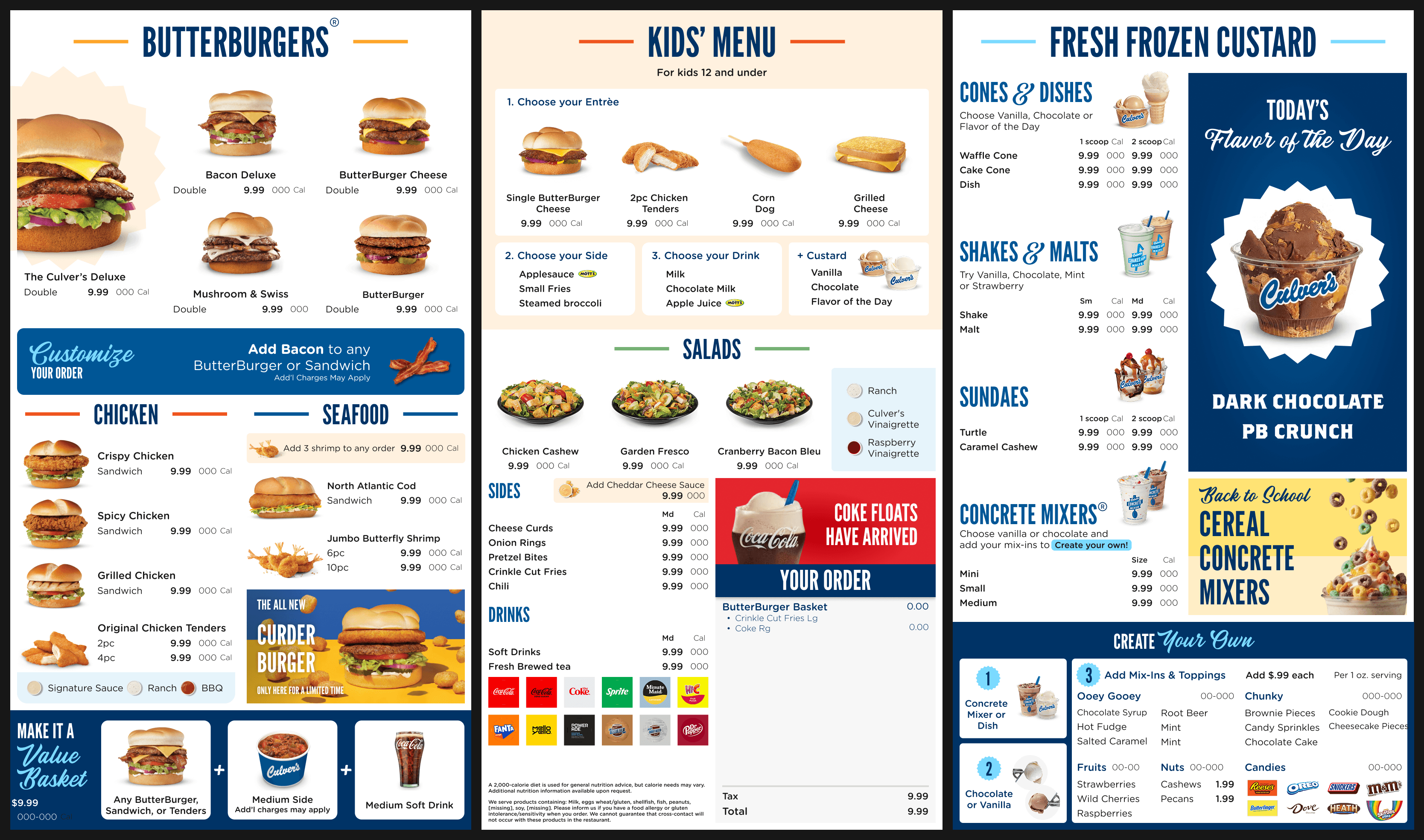
Culver’s paper menu board designs hadn’t been touched in nearly 10 years and any updates easily took 5 to 8 weeks. it was easy to look at and hard to actually read. the whole system needed an overhaul to keep up with the changes in today’s 1,000+ locations. i owned the ux and visual design of the digital menu boards that guests see.


approach
rebuild the system, not just the menu
we took Culver’s menu boards and rebuilt the whole thing into a dynamic system that updates overnight. i owned UX and visual design end to end. here’s how it went:
1
we watched and we learned
the broader team (shoutout team!!) ran 12 site visits and talked to 28 guests at high-volume locations to see how people actually order, and where the board helped or got in the way.
we learned that indoor guests spend about two full minutes just reading the board before they order; at the drive-through, they’re more stressed about the time they’re taking to order and wait.
it’s the same menu, but two different experiences for two different guests.
2
we defined
that split gave us two personas to design for:
the local
knows exactly what they want and orders the same thing every time. not opposed to trying something new, but new things are “hard to find.”
the new visitor
doesn’t know where to start or what’s good, and gets “overwhelmed easily” by the choice overload on the existing menu.
3
i designed
the client chose Middle-out to start with, a little wary of changing things up too much; we scoped a hypothesis so they could test after handoff.


4
i built
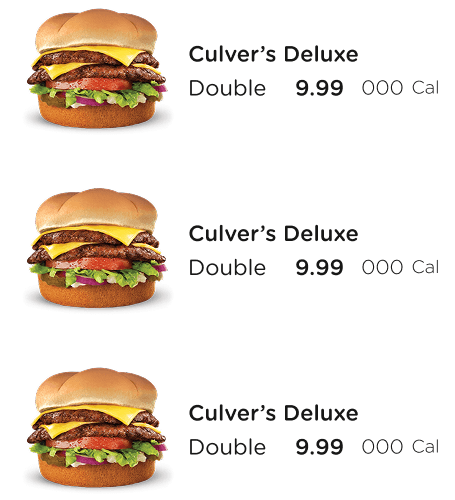
then the fun part!! i built the design system underneath it all: a flexible grid that lets any location update without anyone touching a layout, a three-tier modular component pattern, and a type, color, and space hierarchy built to be read from across the room (or from a car).


impact
pilots are live, with rollout to all 1000+ locations by 2029
the first pilots went live in October 2025, with a phased nationwide rollout through 2029 handled by our implementation partners.
my part was the design system underneath it: a menu system built so any location can update without rebuilding a layout, which is what turns a 5-to-8-week update cycle into something that can happen overnight. whether clearer ordering actually lifts sales is the open question we planned to answer with further testing post-launch.

