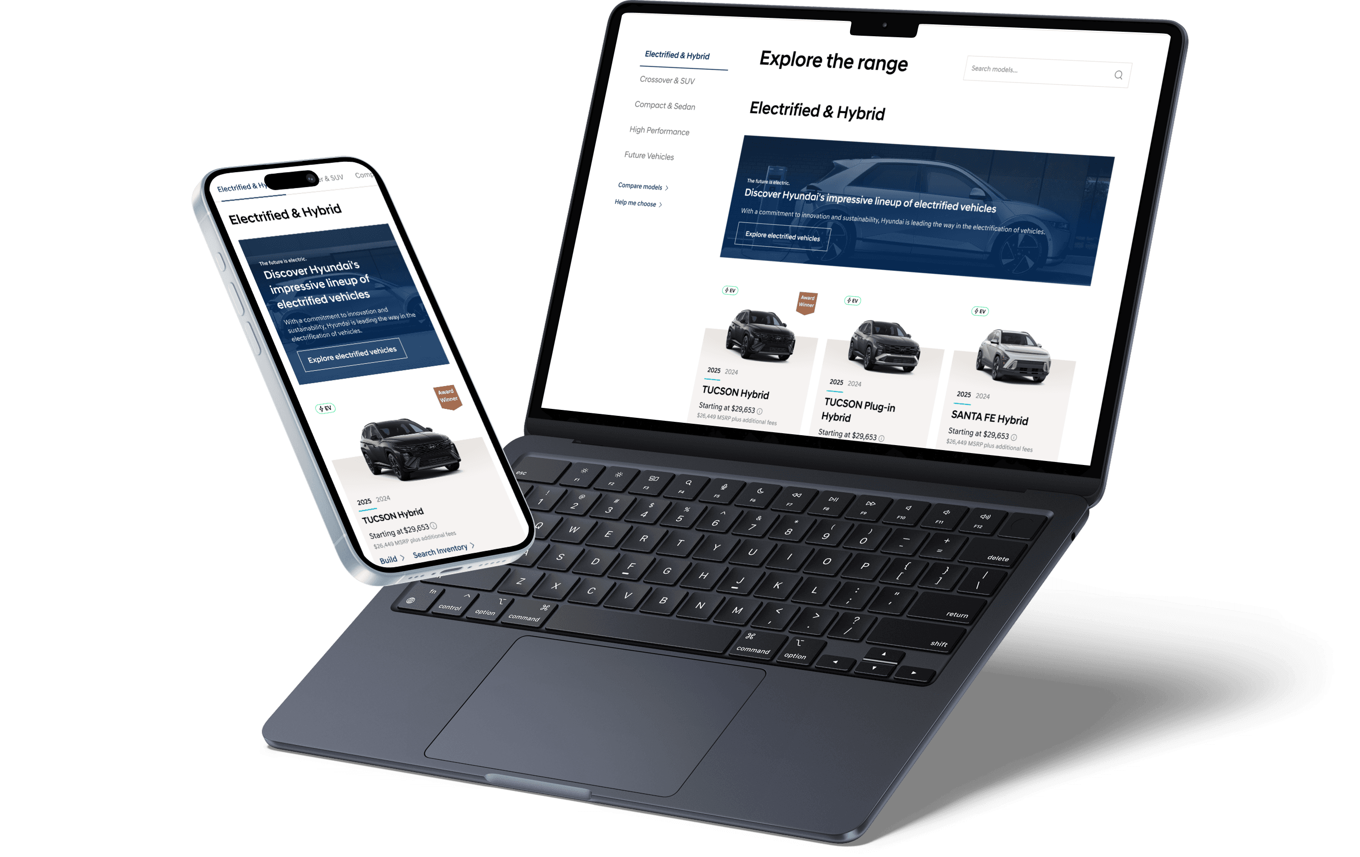
background
a migration that made a long-overdue redesign unavoidable.
One coherent experience across every stage of the car-buying journey, from discovery to conversion.
1. we audited
We did the research so we could borrow what worked and skip what didn't, instead of starting from scratch for the UX. Client told us to use Hyundai USA as the north star, so we studied that plus Korea, Australia, and Worldwide. Then competitors like Ford, Rivian, and Genesis, and best-in-class sites outside auto like Apple. We compared what worked elsewhere to the existing Canadian site and used it to inform the redesign. There was an existing palette but we built a full design system from scratch.
approach
might as well rebuild the system while we switch platforms
1
we audited
We audited the current site and ran competitive research at the same time. We looked at Hyundai USA, Korea, and Australia to see what other Hyundai sites were doing and figure out which features to keep, add, or cut. We also looked at in-industry competitors like Ford, Rivian, and Genesis, and best-in-class sites outside auto like Apple, to see how other people were solving similar problems.
A few things stood out right away. Across the site, naming was inconsistent, some pages didn't have a clear purpose, and key flows were missing steps nobody had questioned. Build and Price was the biggest example: the flow would sometimes skip a step entirely with no explanation. In reality, that model or trim just didn't have more options, but the user had no way of knowing that. It just felt broken.
2
we defined
Six batches, 15 weeks, four client meetings per batch. We kept a live tracker with every decision and open question because things had a way of being forgotten by the next call. That tracker became the backbone of the project.
Build and Price became the highest-priority flow early, which meant reprioritizing everything else around it. Some things got cut along the way: user testing, 360 vehicle views, and dealer pricing logic until postal code questions got resolved. Every batch followed the same cadence: audit, wireframes, design, revisions. No room to fall behind.
3
i designed
I owned Book a Test Drive end-to-end and led parts of Build and Price, while contributing to all 15 flows alongside four other designers through reviews, critiques, and component work.
4
handoff
Batch by batch, with Jira tickets, dev files, component library updates, and change logs. It wasn't one clean moment; it was an ongoing back-and-forth between what was designed, what was buildable, and what was still being figured out.
Late in the project, someone on the team said out loud that we might have overpromised and would end up underdelivering. So we got honest: documented what was dropped, flagged what needed attention, and handed off a component inventory so Hyundai could deprioritize anything they weren't planning to use. The structure was built so they could keep going without us.
impact
Handed off and in development.
The redesign covered 15+ flows and 20+ pages and templates, supported by a modular design system built to scale within AEM's constraints and adapt to future use cases. The work strengthened alignment between Hyundai Canada and its dealer network and established consistent patterns across touchpoints. We also documented a backlog of future enhancements, including personalization opportunities and an A/B testing program targeting Build and Price completion and test drive submission rates, to support ongoing optimization beyond the initial engagement.

